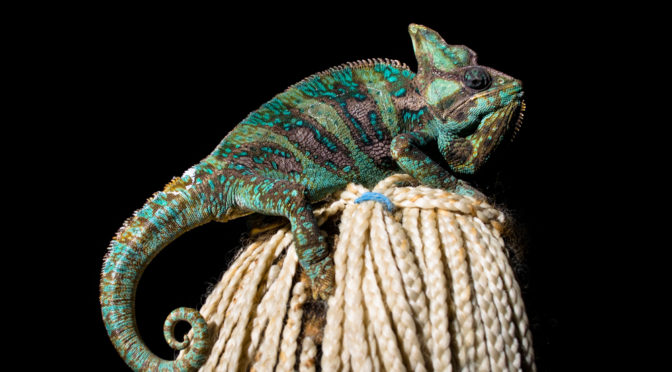
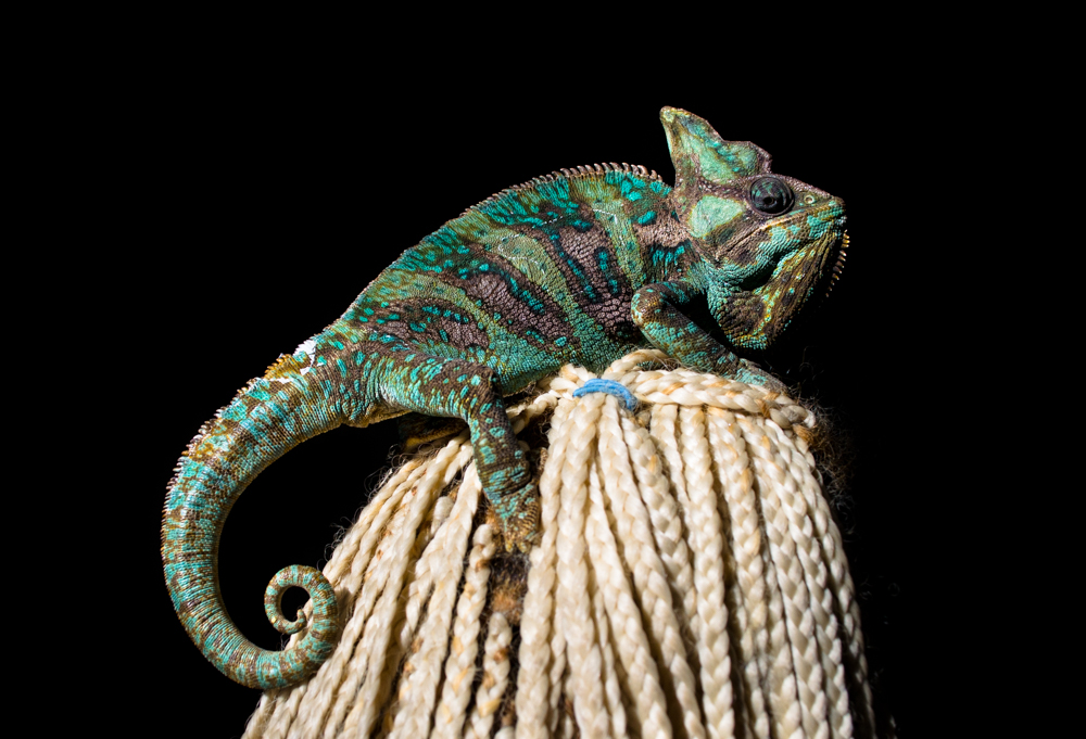
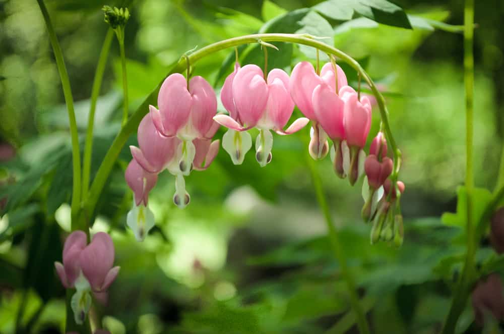
This is Earl, a panther chameleon owned by one of my husband’s students.
In January of 2014 she brought him in to visit and get some healing. He climbed up to the highest spot and the light from our living room window was perfect to completely illuminate him and darken the background.
Some really simple editing eliminated the background entirely and brought out his gorgeous colors.
I don’t even remember taking this photo (May 29, 2014).
But I like it.
I tried editing it to give it the tone I wanted. I’m more or less happy with it, but I still feel I didn’t quite hit the mark on what I was feeling about it.
I will probably go back and edit it at another date.
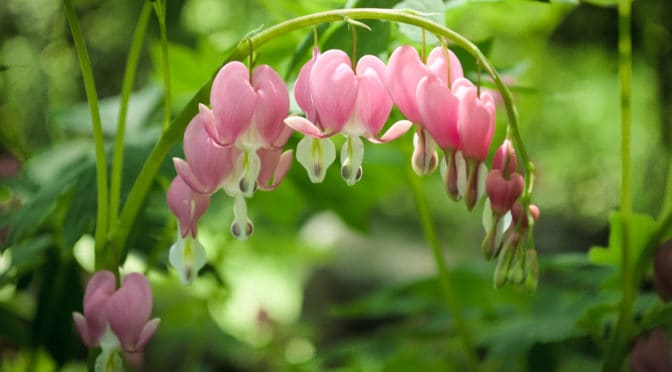
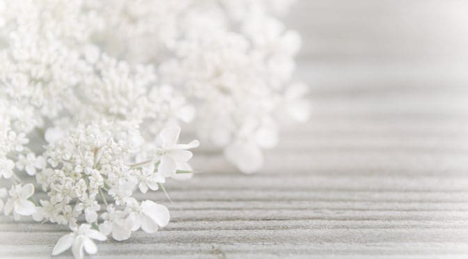
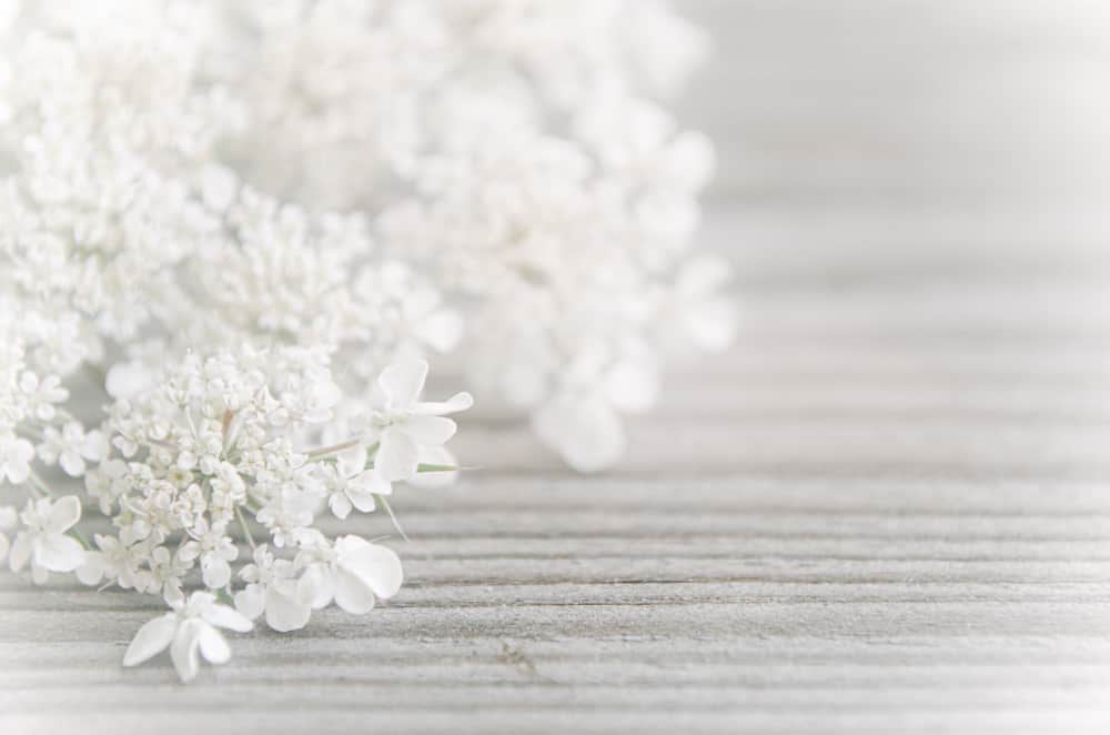
They’re not actually. They are just the common weed Queen Anne’s lace laying on our porch railing. But the way I edited the photo reminds me of lace and romance and weddings.
This is another example of an image I took awhile ago (July 12, 2016) and found a new way to edit it today.
I like this result a lot more than the original, which, though still pretty, was dark and didn’t evoke the emotion I really wanted from it.
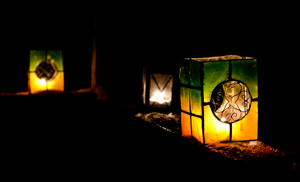
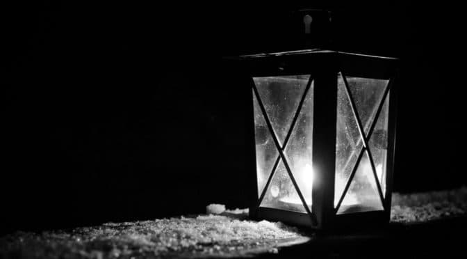
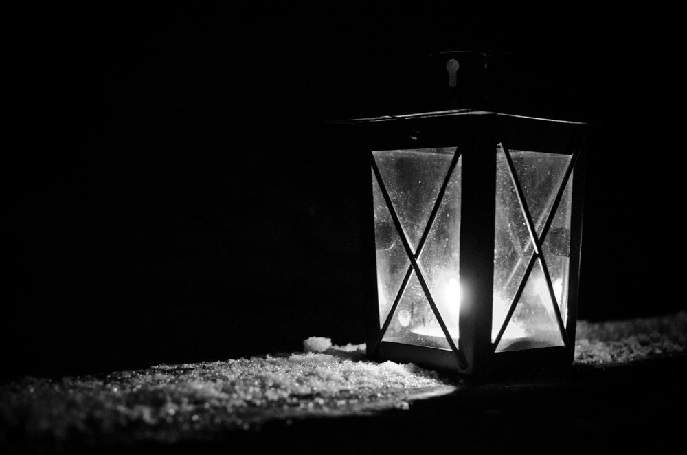
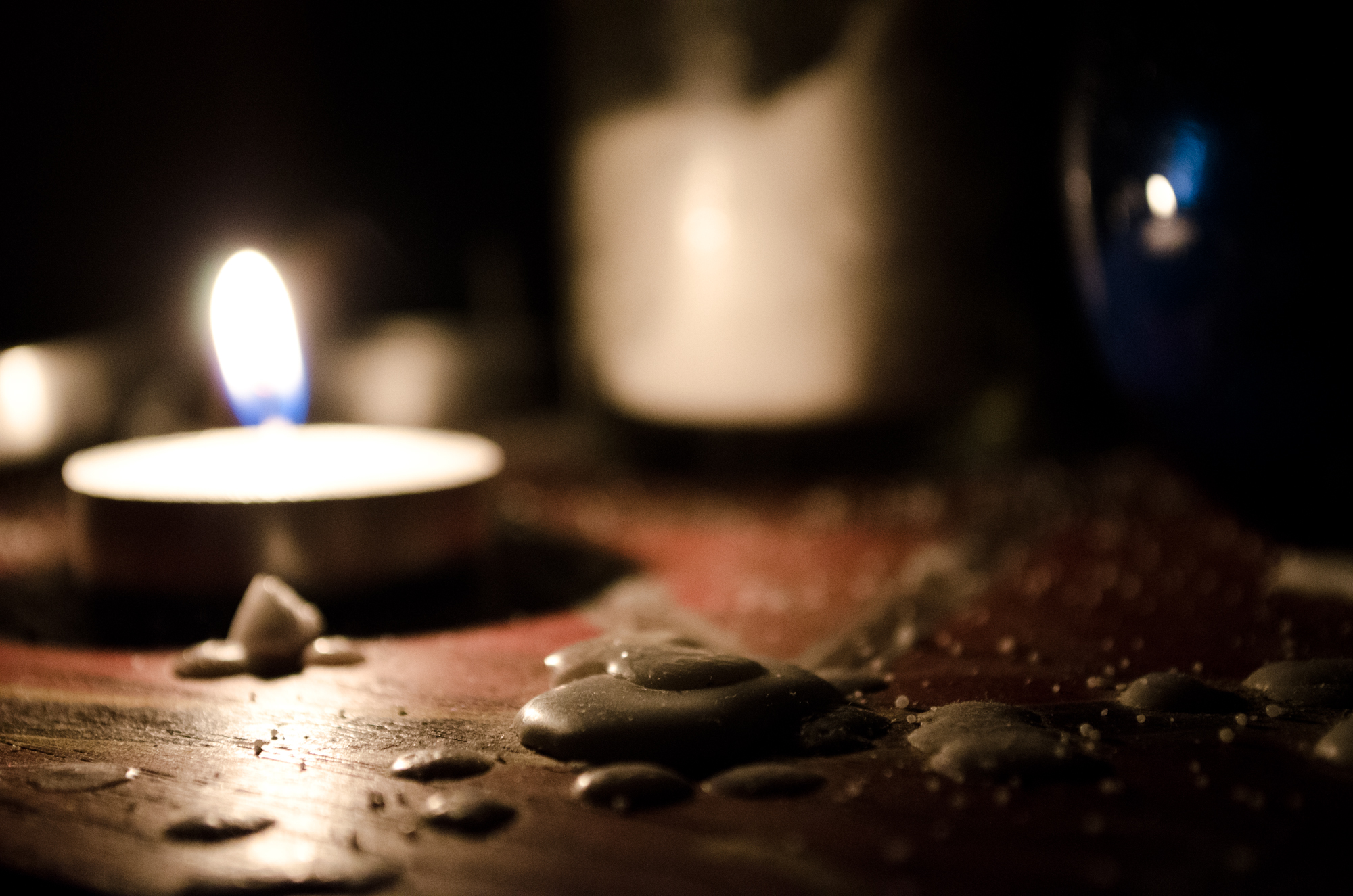
I took this on Valentine’s day 2014. We actually had these outside on our deck to celebrate the Lantern Festival around Chinese New Year. This particular lantern is black, it was (obviously) dark and the snow was white; I felt it was best rendered in black and white. The little tealight provided all the light for the photo. I used a tripod and a longer exposure to capture it.
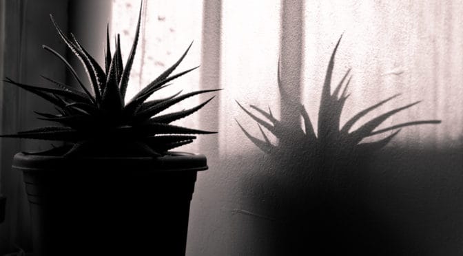
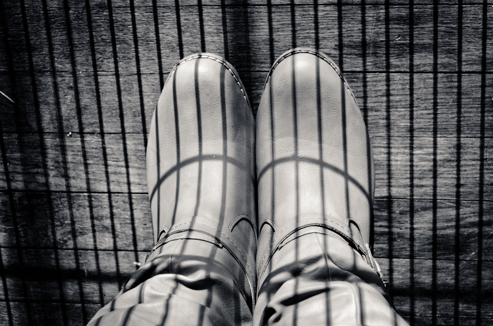
Shadow of my window frame and potted cactus against the wall.
This one I took in January of 2014. One of the first times I experimented with shadow and shape. I really liked the combination of the shape and varying tones of the shadows cast by the plant and my window frame and the texture of the painted wall they fall on.
It was a photo I took on a whim that I never wound up doing anything with, but I find that I actually really like it, despite the fact that it’s a departure from the kinds of photos I generally like to make.
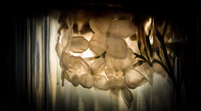
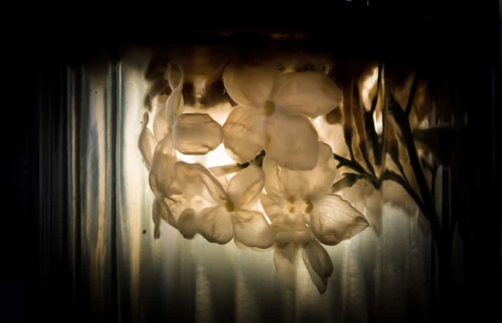
Leftover lilac blossoms that drowned and bleached in the bottom of the jar the bouquet was kept in.
I have been trying to be active on Instagram lately and recently started following a profile called Lovely Dead Crap, which I adore. It’s mostly artistic photos of dried flowers and outdoor plants that have gone by in autumn. As soon as I found the page I thought of this photo.
I took this in June of 2013 because I found myself drawn to the strangeness of the flowers that had fallen into the water. There was something beautiful and sad to me about them. I took the photo and played with it in Lightroom but always felt strange about sharing it so I’ve just been sitting on it all this time.
I figured now is a good time to do something with it. Maybe someone else will like it too.
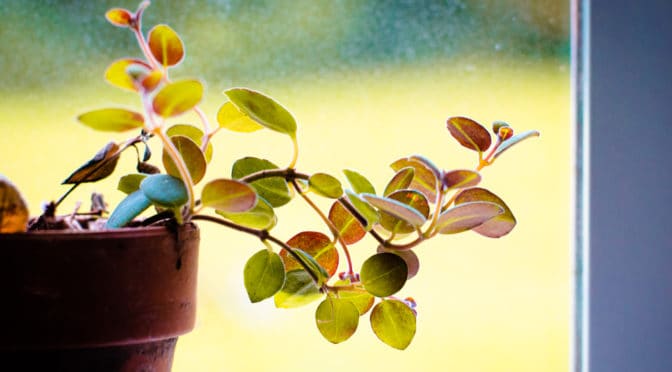
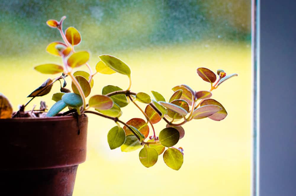
Potted codonanthe cuttings in the window against the morning sun.
I’m always a little self-conscious when I put up a photo that I like “just because”. I always think Is it good enough to display? Will people think I’m amaturish for putting up such an image?
But what does it matter, really? Taste is subjective. We like what we like and there isn’t always an explanation for it. I choose subjects that speak to me. Maybe they don’t speak to you the same way (or maybe they do; if so, cheers!) but something about them is beautiful to me.
This image caught my eye this morning as I was making breakfast. I love this plant and I had placed these little cuttings into a tiny terracotta pot on the kitchen window, in hopes that they might take (they have). Something about the light, the colors and the distant, pastel background really struck me as beautiful.
I actually used it as a practice piece in Lightroom, as I wanted to tweak the colors a bit more to accentuate them (it was the color that got me in the first place). I used the Color and the Calibration sliders to get the feel I wanted. I also ran it through Photoshop to remove a couple of small elements that I found distracting.
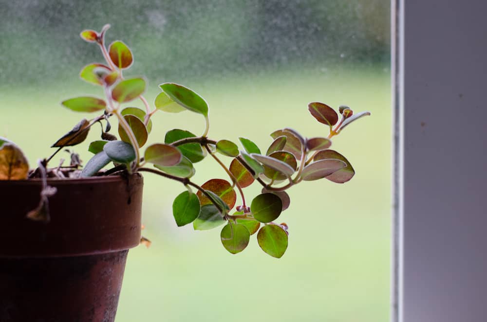
Here’s the original:
Original out of the camera (cropped only).
I wanted a warmer, brighter, summer sun feeling. I’m pretty happy with it, though I feel it could be better. But I’m learning, and that’s what this project is all about!
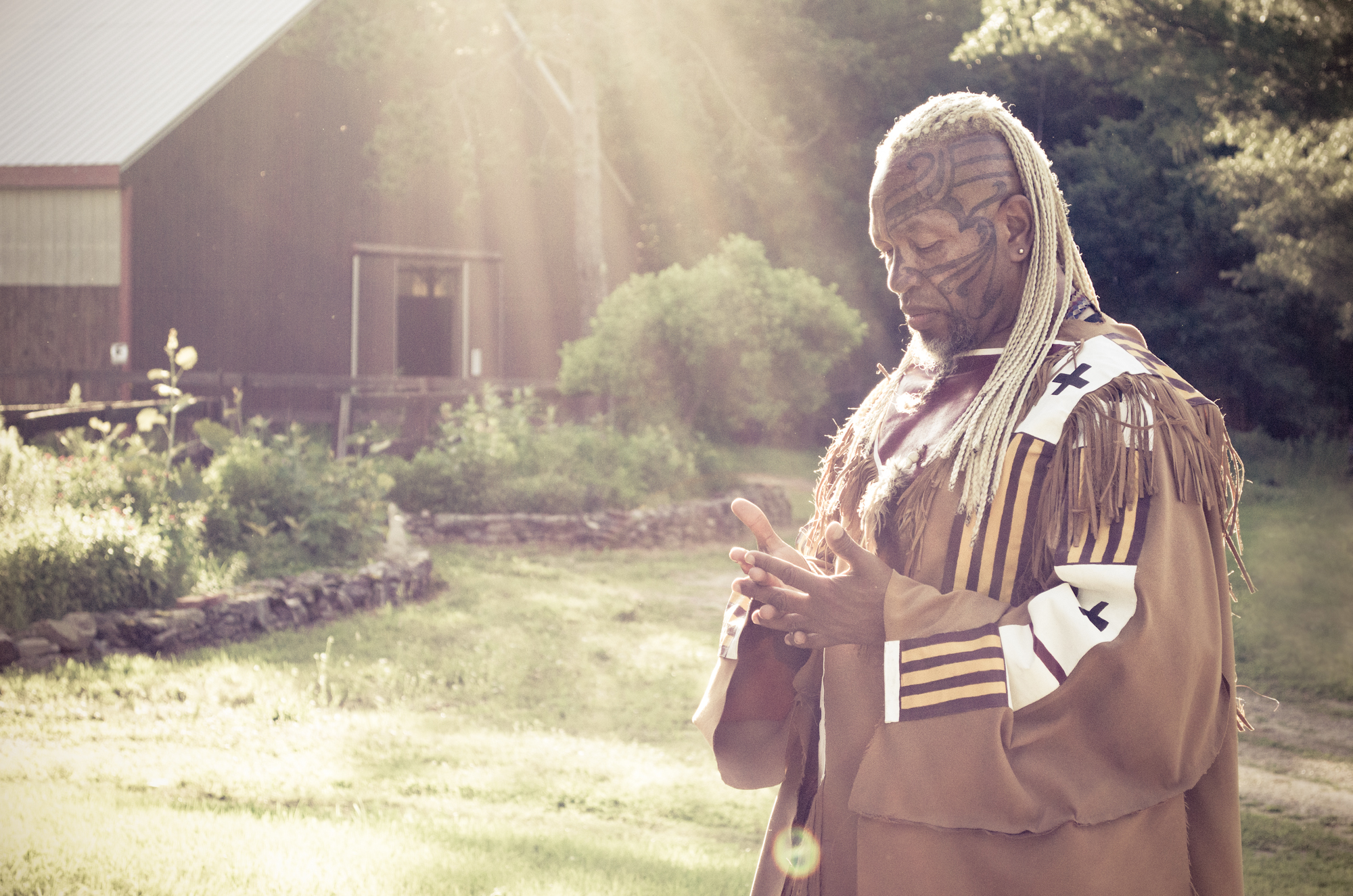
I LOVE these photos. We were back at the farm filming again and my husband and I were sitting outside eating in the back of the car when I noticed the gorgeous rim lighting on his face and asked if I could take some photos. These are my favorites.
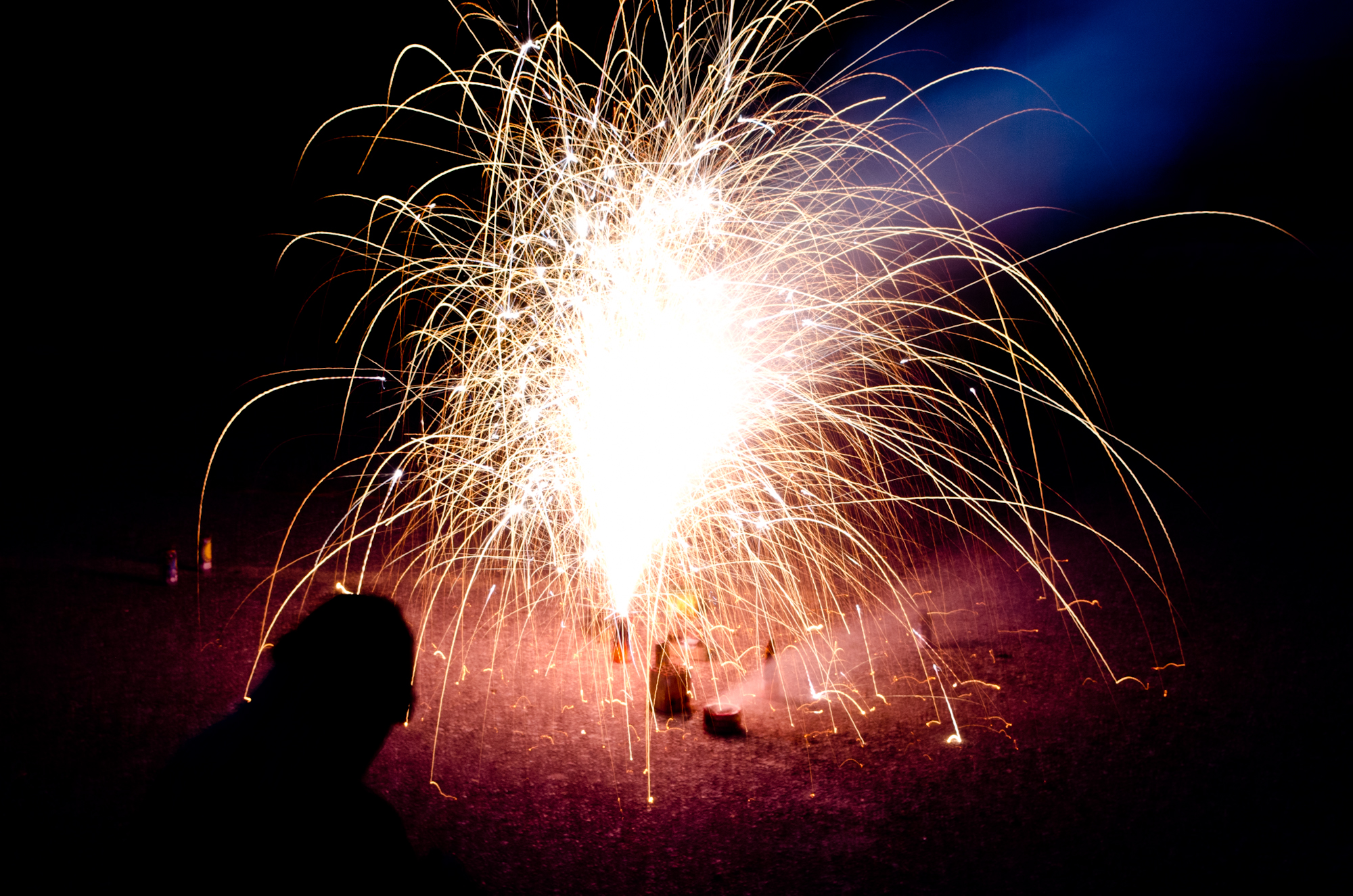
My husband standing in front of our Fourth of July fireworks. It took me a minute to figure out what settings I wanted to use for these images, and I like how this one came out with the long light trails and the colors.
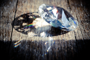
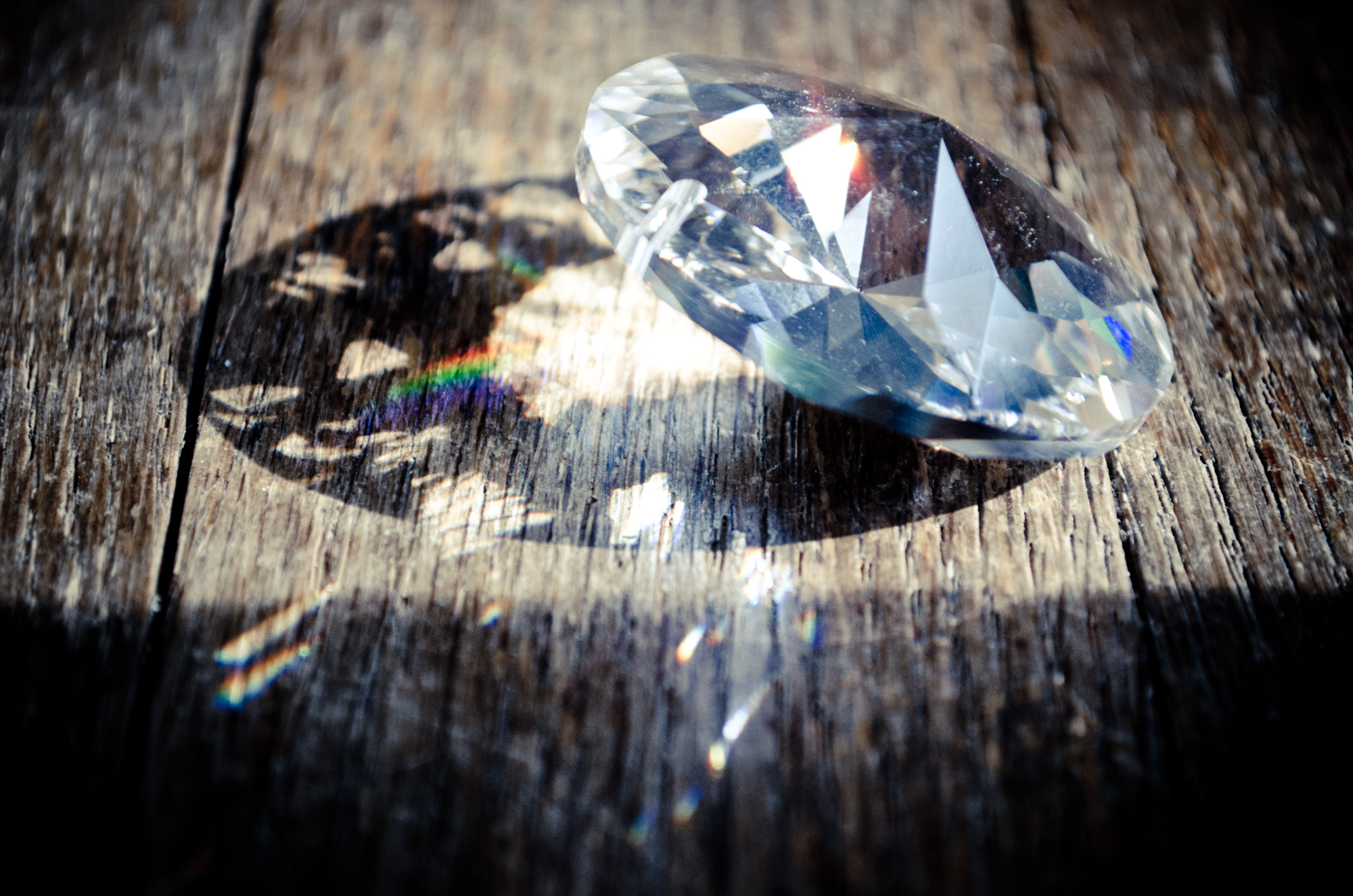
I caught the slanting afternoon light on my office floor and knew I had to do something with it. But what? I started by photographing a clump of dried hydrangea in various positions but wasn’t happy with what I was producing. Then I saw a flicker of a rainbow from a prism outside and remembered a large prism I have. I like the contrast between the angles of the prism and the texture of the wood (and, of course, the rainbows!).
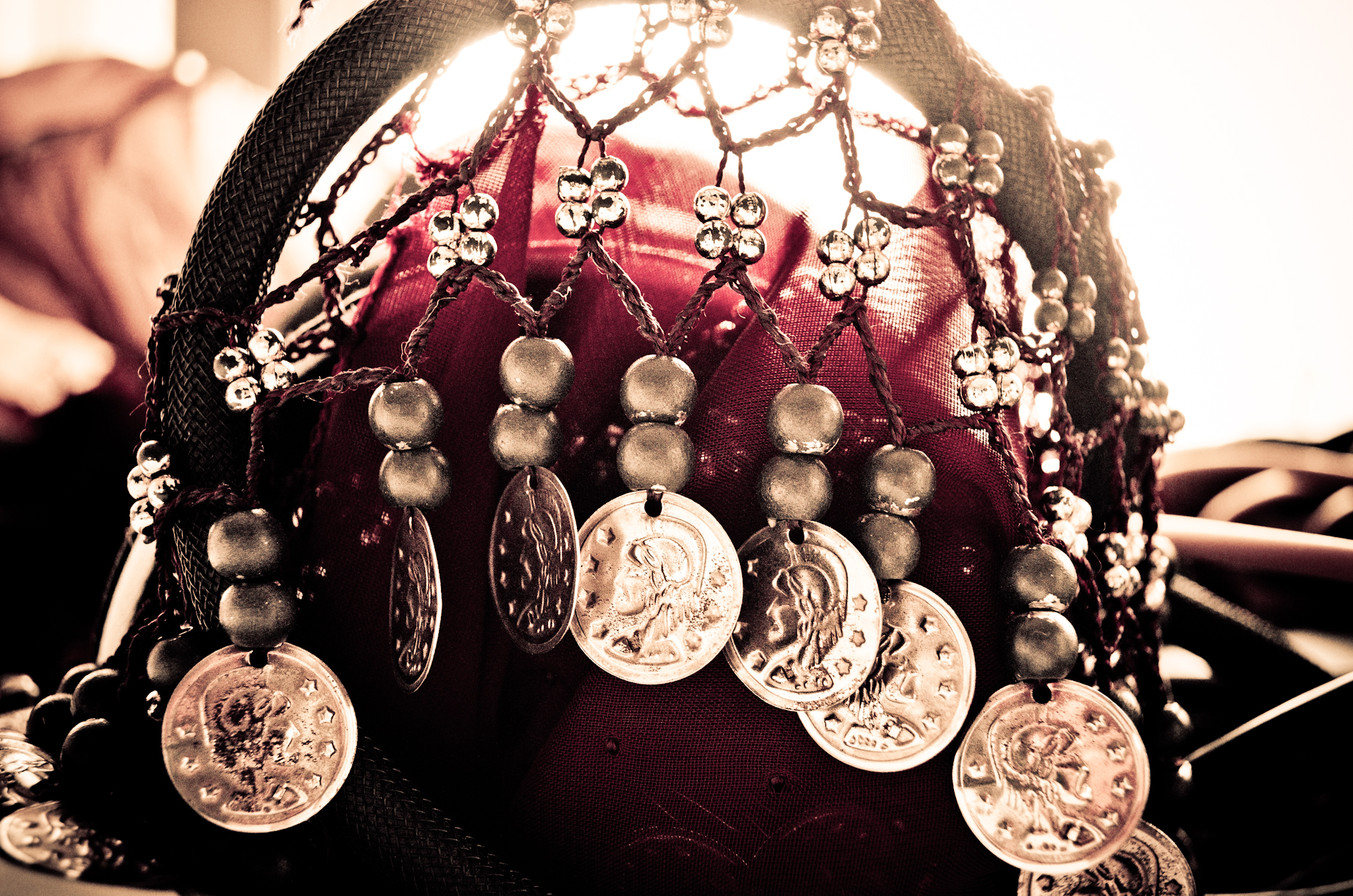
My belly dance coin scarf tossed onto my table created an interesting shape as it draped over a looped microphone cord. I tried processing it in black and white but I really liked the burgundy color so I increased the contrast and softened the highlights from the window in the back and warmed up the overall tone a bit. It gave it a dreamy effect while still maintaining the texture of the cloth and the cord (and, of course, that color!). A bit of a departure from my regular stuff but I am pleased with the outcome.